Understanding Renko Chart
-
- 0
- 1214
- 0
What is a Renko chart?
A Renko chart is a Japanese graphical representation of the trend in block form.
A Renko is not plotted according to time but according to prices only (using a predefined variation unit).
A Renko chart enables traders to determine the current trend easily and quickly.
A Renko chart also enables traders to determine trend reversals.
Renko calculation formulas
A Renko chart is a function of usage variations determined by the trader. The variation unit can be set as a point or a percentage.
A new blockis added to the Renko chart as soon as the price increases or decreases by the chosen variation unit.
Example: if the unit of variation is set to 1%. As soon as the price rises by 1%, a green block is added to the Renko chart. As soon as the price drops by 1%, a red block is added to the Renko chart.
The variation unit for a Renko chart can be applied at different prices:
- Closing
- Opening
- Highest
- Lowest
- Typical: (High + Low + Closing) / 3.
- Weighted: (High + Low + 2 times closing) / 4.
- Median: (High + Low) / 2.
- Total: (Opening + Highest + Lowest + Closing) / 4.
Using a Renko chart
A Renko chart enables traders to detect trend reversals. A reversal in the trend in a Renko chart is shown by the appearance of the oppositely coloured block.
There is a reversal in a bearish trend if the Renko chart shows a green block after a succession of red blocks.
There is a reversal in a bullish trend if the Renko chart shows a red block after a succession of green blocks.
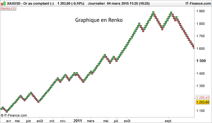
1% Renko chart
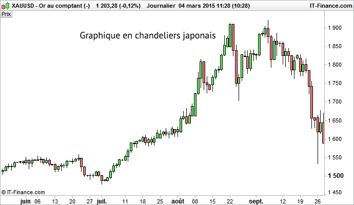
Japanese candlestick chart